Truck Display System
Truck Display System (TDS) is an internal web app for Zume Pizza to help our Captains cook pizzas and prepare orders on our mobile food trucks.
My Role
I led design from end to end, working closely with our head of product, a senior frontend engineer, 3 backend engineers, and our in-house fleet of delivery drivers and truck captains. We held daily standups and were in constant communication (our office had about 25 people). The first phase of this project was completed over 3 months in Spring 2017.
from Homecrux
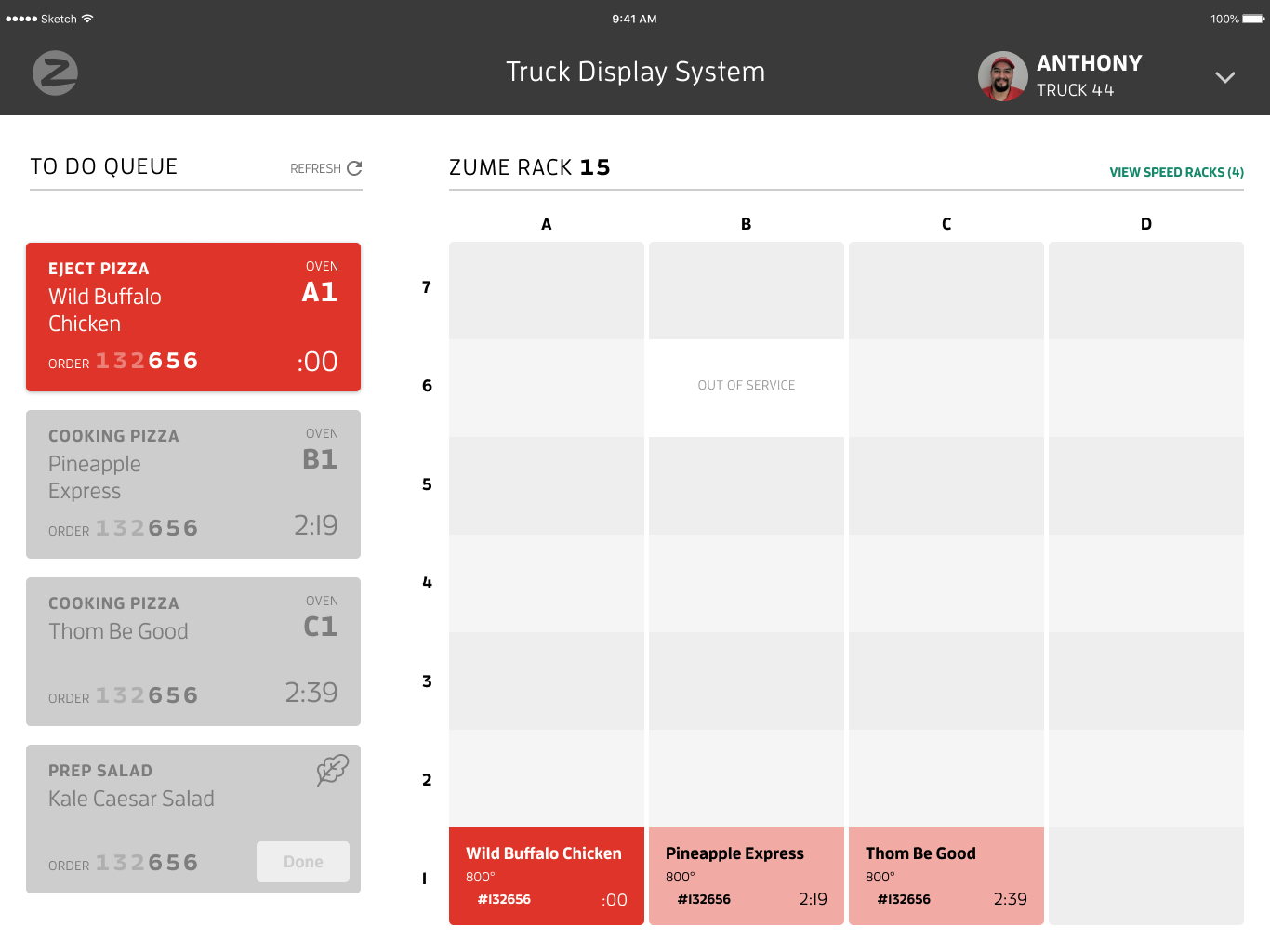
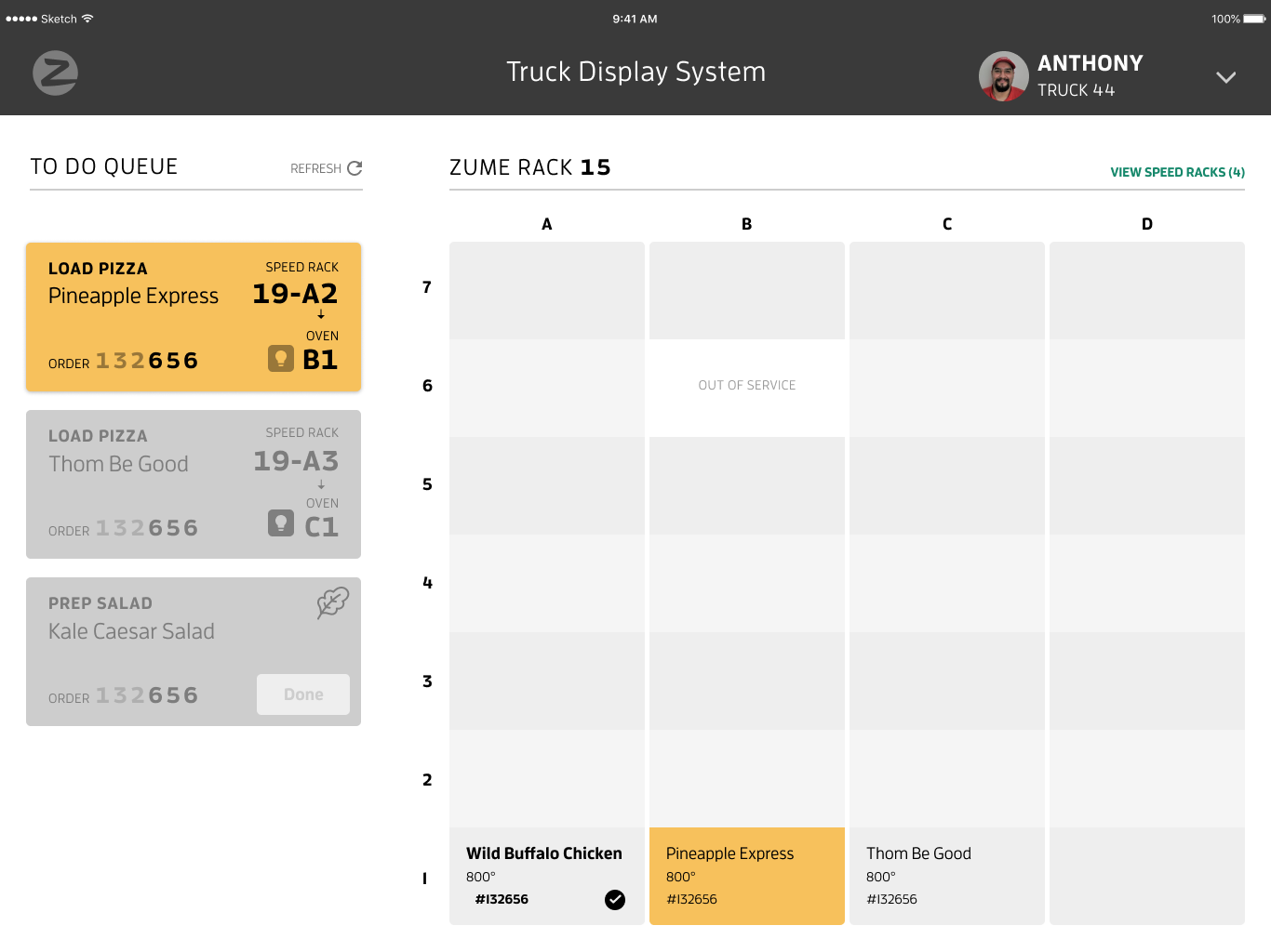
Screen from final TDS design
The Challenge
Changing food delivery operational models
Zume Pizza was founded with a patent for baking while delivering right to the customer’s door, or Bake on the Way. As a soon as an order came in, a driver loaded a pizza into an oven, and started driving to the customer’s house. The oven automatically turned on at the perfect time, so the pizza finished cooking just as the truck pulled up to the house. The customer received a pizza fresh out of the oven. (Sorry DiGiorno's!)
This was great for food quality (where the dwell time was just a few seconds) and marketing buzz, but not for operational efficiency. While this primary delivery method worked well for low order density periods, during peak hours (12-1pm and 5-7pm), the truck became a bottleneck.
When I joined in March 2017, we were delivering orders out of our commissary (in the back of our office) and preparing to launch Forward Deployment, a hub and spoke model. Using demand prediction, we would park a truck in the optimal spot for order density, and use smaller vehicles for last mile delivery. That way, we would still cook pizza close to the customer's home, and deliveries would be fast.
Unlocking scalability of markets and labor
With Forward Deployment, we could test new markets without investing in real estate. And if those tests worked, we could replicate this model to scale our pizza operations across the Bay Area quickly and cheaply—as long as we could hire and retain employees to do so. The labor aspect was key, as high turnover is consistently cited as a big problem in the restaurant industry. For the economics to work, only 1 chefs (or 2 in peak hours) could operate on the truck, so there wasn't room for a traditional kitchen manager.
With our mission to rethink the restaurant industry and to use technology to help people, we approached this as a design challenge:
Can we empower someone with no food preparation experience to produce high-quality pizza?
If we could, we'd increase our potential labor pool, making it cheaper and faster to hire. We had already engineered an intelligent hardware system on our trucks. But we needed a way to make the complicated system digestible (ha ha) for the chef on the truck, otherwise the model would fall apart.
Hypothesis
An easy-to-learn, easy-to-use interface will power Zume Pizza to scale rapidly with the Forward Deployment model.
Discovery
Activities: interviewing, observation, ridealongs, first-hand pizza-making, system analysis
Understanding the user: Captains
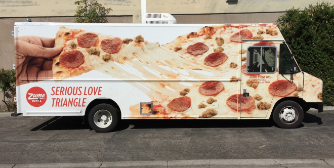
We had an in-house fleet of around 15 delivery drivers (or Pielots, as we called them), and Captains (truck operators and chefs) who would be using our software to make pizzas on the truck.
Our fleet members were generally in their 20s, had limited professional experience, and were comfortable using apps and technology as consumers. Luckily for me, I had a very close feedback loop with our users, since they were full time employees. I observed our demo pizza-making flows on the trucks (note: if you have the opportunity to work at a pizza company, the free pizza makes it worth it), got to know the Pielots and Captains, and even cooked some pizzas myself.
The Captain's pizza-making journey looked like this:
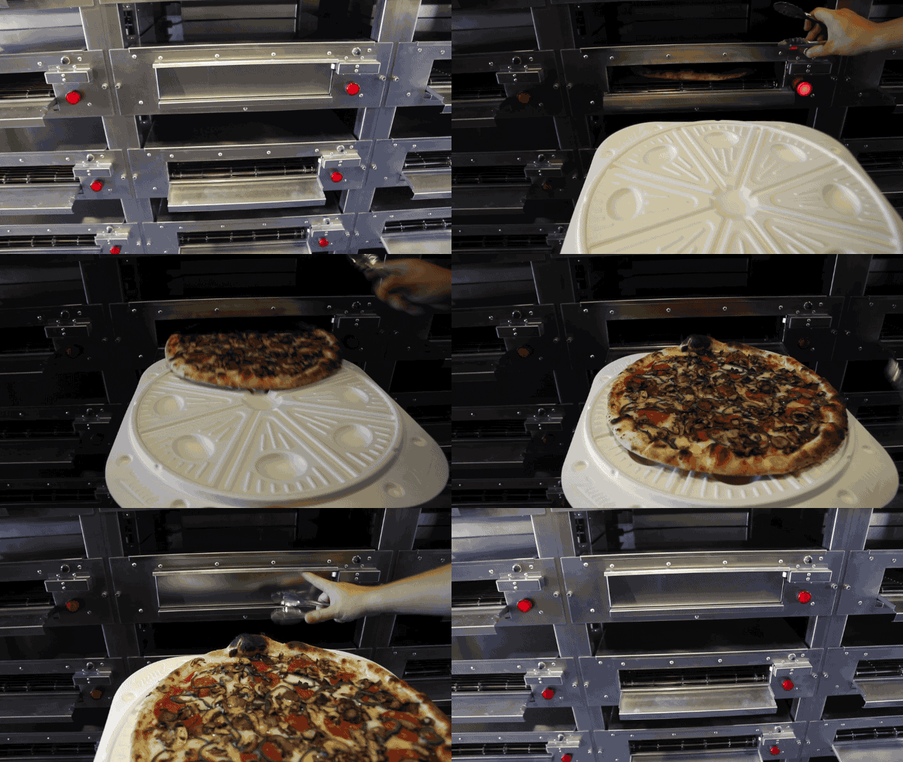
An order came in, and the Captain would take use a pizza peel to take a pie from a specific refrigerator slot into an oven, press the button on the oven to start cooking, and then wait until the oven light went on, to signal the pizza had finished cooking. The Captain would use the pizza peel to eject the pizza from the oven, adding any finishing toppings, and put it onto our special pizza box that had grooves to cut along. Then they needed to assemble all the items in an order, put it in a hot bag, and hand off to a delivery driver.
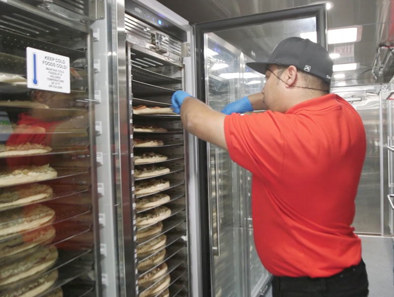
from Zume Pizza
Understanding the system: smart ovens and sorting algorithms
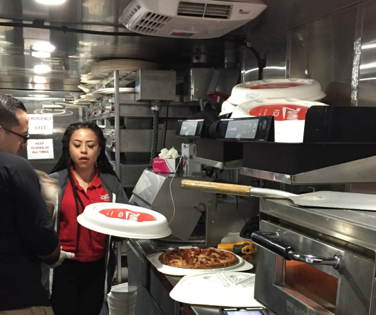
Inside each truck was a 20-ft long stainless steel kitchen, outfitted with 56 cloud-connected smart ovens, 4 refrigerated inventory racks, a prep counter, and hothold areas.
We equipped each vehicle with a truck computer that created wifi on the truck, to connect to our orders API and inventory manager. When an order came in, the truck computer knew which refrigerator slot to take a pre-topped pizza from, and our backend algorithm determined which oven to assign it to, and its cook profile.
Definition
Activities: analyzing observations, identifying pain points, understanding constraints, defining scope, competitive analysis
After understanding the human, operational, and technological systems, I synthesized a few key findings.
Adding stability to a chaotic environment
A Captain is always in motion—loading pizzas in and out of the oven, cutting, boxing, storing, handing off to drivers—so it was important to create something stable and constant, a reliable source of information amidst the controlled chaos of a kitchen. A Captain would need to be able to quickly digest information and act upon it. And since they're already quite busy, we should add as little to their workflow as possible.
Smart ovens... without displays!
Our ovens had no visual indicators other than a light and a simple button. So it was near impossible for the user to tell the status of the oven. Our solution would need to show statuses of the ovens—all 56 of them.
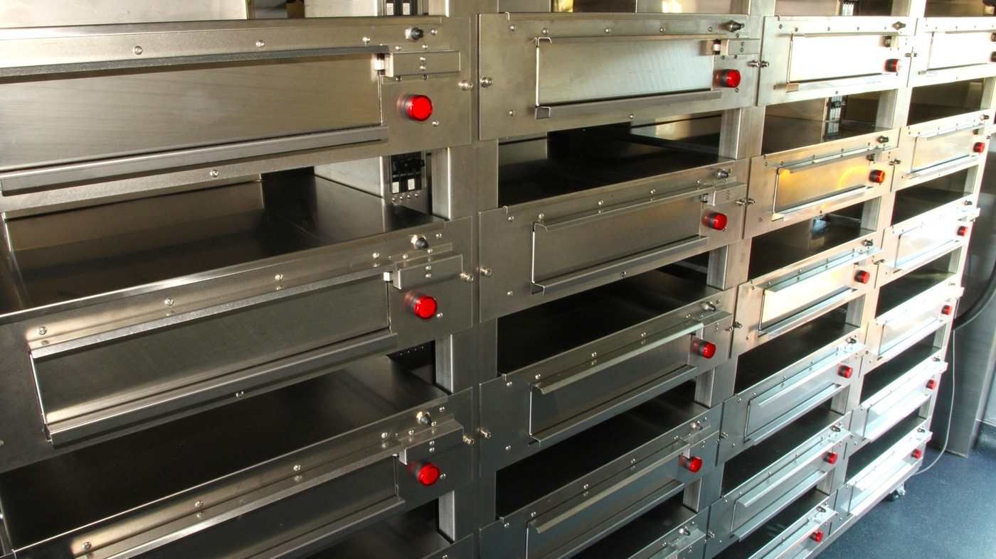
from Zume Pizza
Leveraging an action-based mental model
Most existing kitchen display systems were digital translations of the paper receipts used in many kitchens. They use a mental model centered around orders, items, and ingredients—the action is an implied "prepare this", which is all a trained chef needs.
We had several key differences from traditional kitchens. Because our pizzas were pre-assembled, our hardware and backend system was based on performing a series of action to create a perfect pizza. Our employees weren't chefs with years of experience, so, without a supervisor on hand, we needed a more prescriptive, step-by-step system.
Instead of using kitchen display systems as our main inspiration, action-based mental models like recipes, GPS navigation, and to-do lists provided a clearer framework.
Lack of precedent → making smart bets
Since there wasn't a lot of historic precedent for cooking pizzas on trucks with 56 cloud-connected ovens, we decided our best approach was to make a few smart bets and test with our in-house fleet in real life. While we brainstormed lots of potential interaction models—AR, voice, wearables—we could prove our hypothesis with traditional software, and decided to design for tablets mounted on our trucks.
Development
Activities: sketching, team brainstorming, wireframing, interactive prototyping, user demos
Using the to-do list model, I started sketching potential solutions. Fitting 56 ovens and their metadata onto a tablet was a challenge, but since the physical ovens didn't show their status, it was essential to keep this information persistent.
Through several rounds of sketching and getting feedback from our development team and Captains, I landed on a structure that dedicated 1/3 of the layout to a to-do card queue (a feed of tasks), and the other 2/3 to showing the grid of ovens and their statuses.
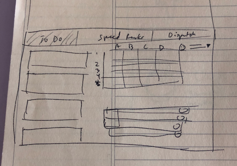
A sketch I used to quickly communicate my layout idea with our PM and Engineering Lead. Sometimes it's easier to show something on paper than talk about it (even if it's very rough!)
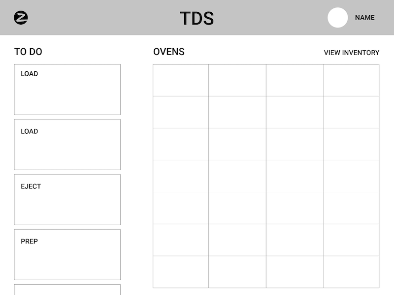
A wireframe of the final layout. I needed to balance having each action card be visible, while fitting in each of our oven statuses
To-do card design
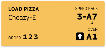
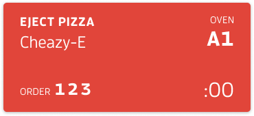
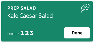
I created a card for each of the 3 main actions, Load, Eject, Prep.
Because each action involved several pieces of actionable and identifiable information—action type, item name, order number, buttons —instead of listing each task as a line item, I designed a flexible card component. I pinned information to each corner, so a Captain could quickly glance at a corner of a card to find information.
Identifying information was on the left side, with the most important—the action type and item name—in the top left, and order number (a secondary identifier) on the bottom left. Because we had long order numbers, I emphasized the last 3 digits, something our fleet had been doing naturally in the kitchen.
The right side was reserved for actionable details, like which refrigerator slot or oven to use, a countdown timer, or a "Done" button.
Balancing screen density with legibility
The ovens took up a lot of screen real estate, so it was a delicate balance to make the cards as large as possible (to be visible from about 6 feet away), while also leaving room for longer pizza names, like "Wild Buffalo Chicken" or any new special pizzas.
Because much of the information was self-evident—pizza names, timers, action types—I removed titles as much as possible.
Consistent color system
I employed color in a semantic way to connect information on the screen, and to make it easier for captains to understand tasks faster than reading words.
I gave each to-do card a distinct color: Eject was red (hot! and the most time sensitive action), Prep was green (to signal completion), and Load was a bright yellow (like a sign on a loading dock). These colors were mirrored in the oven displays for consistency. When a pizza needed to be loaded into an oven, the corresponding oven was also yellow; when a pizza was done cooking, the corresponding oven was red too.
To create a strong hierarchy to highlight the most important action, I designed the to-do queue to only show the top card in color, and the following tasks were greyed out. The ovens were always colored, so a Captain could see their status from a glance, even from across the truck if necessary.

Limiting screen interactions
Because Captains already had a variety of tasks around the truck, I wanted to limit their interactions with the screen as much as possible. Instead of tapping "Done" to complete each task, we leveraged the sensors on the oven to detect when a pizza had been loaded and ejected, which removed 2 tablet interactions for every pizza. The only time a Captain needed to report a real world action to the system was to mark an order ready for pickup, which couldn't be detected by any of our hardware. Using the physical oven interactions to update the display helped instill trust that the system knew what was happening.
Delivery
Activities: engineering handoff, testing, observation, interviews
With a working prototype in place to help our Captains prepare real orders from the truck, I spent hours doing observations and analyzing end of shift reports.
Helping Captains anticipate time-sensitive tasks
In testing our task-by-task solution, we found that choreographing when to take the pizza out of the oven was an intricate challenge. Our ovens cooked at up to 800° F, so if a pizza was left even 10 seconds, it could burn, leading to food waste, repeated work, order delays, and customer support calls.
We handled this in a couple ways. In our sorting algorithm, we prioritized a pizza with under 20 seconds left: the Eject card would stay at the top of the queue, as a "Cooking" card, with the timer prominently displayed. Even if this paused a Captain for 20 seconds, the tradeoff to avoid a burnt pizza was worth it.
I also designed a "Load Soon" card with a timer, to stagger the cook times. That way multiple pizzas didn't finish cooking at the same time (which would inevitably lead to a burnt pizza).
To reinforce the color system, I used related colors (muted yellow for Load Soon and Pink for Cooking) to tie the anticipatory cards with their action cards.
Feedback: limiting screen interactions even more!
Another pain point I noticed was that Captains would often tap "done, done, done" on multiple prep cards.
We assumed in the first versions that being didactic about each item would be helpful to ensure order accuracy, and since our extras (salad and drinks) didn't use our smart ovens, the Captain had to manually tap "done" on a Prep card to inform the system. The tradeoff was adding in more steps for order accuracy.
Upon further investigation, it turned out that Captains were using our other handoff/delivery app (the Pielot app) to see the order summary, and that was the point at which they were adding in the extras. The TDS prep cards were an annoyance rather than a useful notification. So we got rid of them, and started working on bringing the orders view into TDS as a toggle with the ovens view that could be put on another iPad, near the handoff window, much to the delight of our colleagues.
Training prototype
I built a clickable InVision prototype to help our operations team train our existing fleet and new hires.
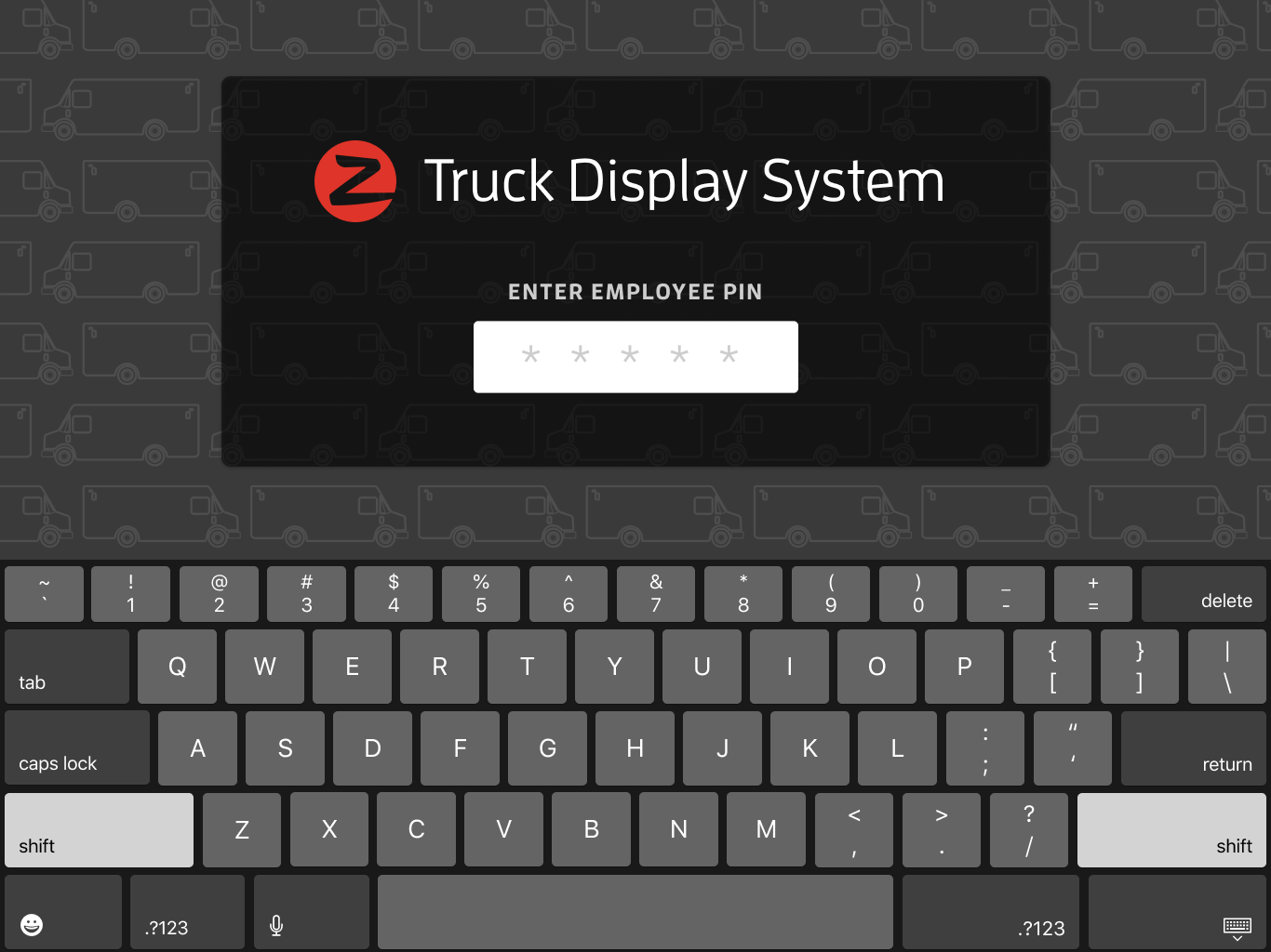
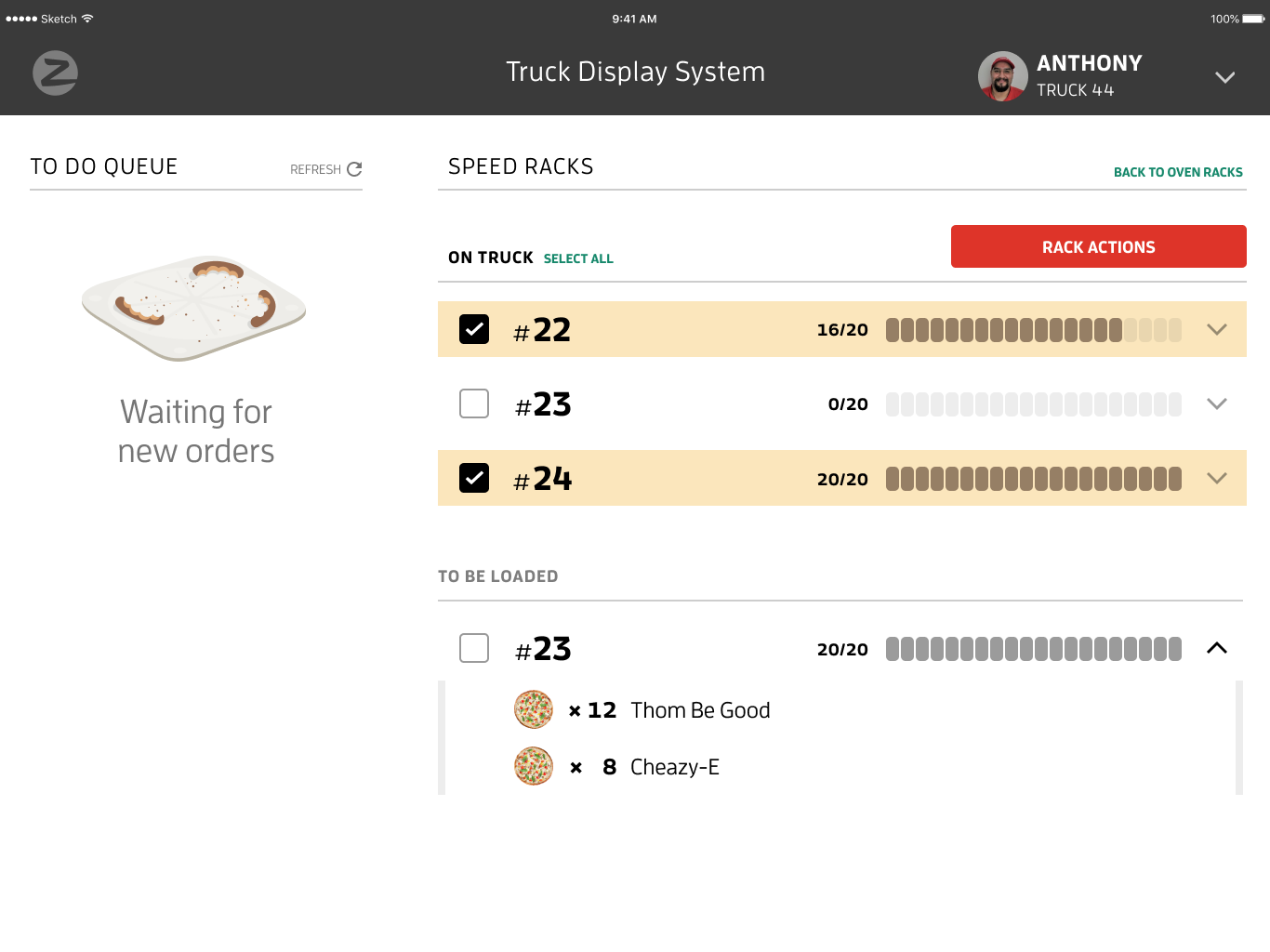
Log in and Inventory views
Results
The work we did for the first version of TDS in Spring 2017 had a huge impact on the future of Zume Pizza (and later Zume Inc.).
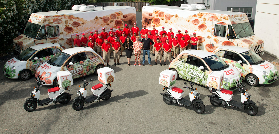
Our fleet and our founders, June 2018. From Zume Pizza
Ease of use allowed for rapid talent acquisition
We hired and onboarded over 50 fleet members. Within 2 weeks they were ready to be Captains on their own. Our employee churn rate was also low for the food industry: many of our longest tenured employees were Captains as well.
TDS enabled high order accuracy
Our on-truck defect rate—wrong or missing items— was less than 1% of all orders. In other words, despite an inexperienced workforce, we were able to prepare perfect orders 99% of the time, which reduced strain on our customer support team.
13 trade areas launched
With TDS as the beating heart of our Forward Deployment operations, Zume Pizza launched 13 trade areas—with a truck kitchen as the hub of each—in 15 months (from June 2017 to September 2018). Prior to TDS and Forward Deployment, we had operated one brick & mortar location from September 2016 to June 2017.
$48M Series B raised
The early success of our first 3 forward deployed trade areas led to our $48M Series B investment in October 2017. This gave us capital to expand our operations and build a food technology platform with forward deployment at its core; this became the foundation of Zume Inc.
Learnings
Hardware presents a lot of constraints. It's easy to imagine an ideal experience in a world of only software. But once you step into a truck with a complex, engineering-driven cooking system, most of those ideal ideas become pipe dreams, and I learned how to navigate a system that wasn't designed with a user in mind to create user-friendly software.