Kitchen Display System
Kitchen Display System (KDS) is a standalone web app for restaurants to manage back of house food preparation on tablets. It ingests orders from multiple channels, and guides chefs on what items to cook when, which order they're a part of, and who to hand off to—delivery drivers or pickup customers.
My Role
Through various iterations of KDS over 3 years, I've collaborated with 5 PMs, software & hardware engineers, product & industrial designers, and stakeholders like Zume Pizza chefs, delivery drivers, and the operations team. I led design for the first version for Zume Pizza, for our &pizza partnership, and for launching KDS as our first SaaS product (along with the creative direction for the launch). I rotated on and off of this project with another product designer, who focused on a customer pickup & cubby solution and was my partner on most of the research. I also partnered with another product designer on a multi-location flow.
The Challenge
We first developed KDS as in-house tool (Truck Display System) for Zume Pizza, with an algorithmically-sorted to-do queue and live statuses for 56(!) smart ovens on our delivery trucks. As Zume expanded as a B2B food operations platform, our challenge was to adapt our single use-case app into flexible product that could be used first in any configuration of a Zume Mobile Kitchen, and later for any fast-casual, brick and mortar restaurant.
The original tool was designed and built for the very specific constraints of Zume Pizza—connected ovens, inventory management for non-customizable items, one chef, specific vocabulary, and for pizza to name a few.
We needed to make KDS work for nearly any cuisine, with multiple users on multiple stations (i.e. prep and finish), customizable items, customizable vocabulary, and disconnected ovens (like you would see at a Subway or Starbucks).
Hypothesis
Our internal pizza prep tool can be adapted to power food production of non-pizza cuisines with traditional ovens
Discovery
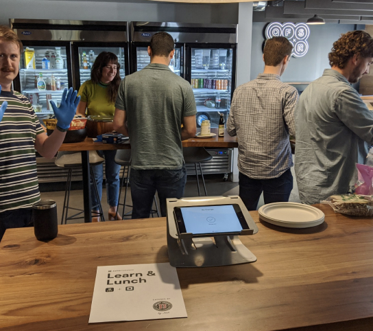
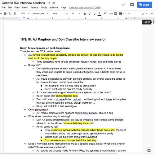
Working with another product designer and PM, we started conducting hours of interviews with our in-house staff, captains, managers, chefs, and engineers to start thinking about what this more dynamic version of KDS should entail.
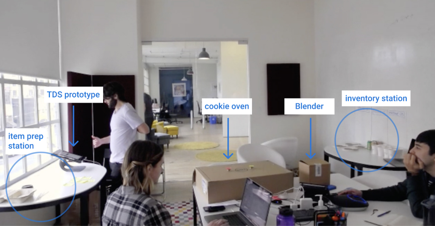
Since we had never tried anything outside of pizza before, we prototyped some new ideas using other food. All of our trucks were set up for pizza at this point, so we came up with ways to prototype other cuisines. This was a cardboard setup for a milkshake and cookie truck, and we had our coworkers go through a couple orders to see how it might work.
It was really important to try to approximate the physical world, because really what the software is about is cooking food. If you try to test the app without food, it’s just tapping on the screen, and not realistic at all.
Definition
Key learnings → design principles
Building on the interviews and testing, I wrote some principles to help guide our design for KDS. One of my favorites was a mantra from Zume Pizza—technology exists to benefit human lives—which I added guidelines for how that should influence our design decisions. Another was that the captain was in constant motion on the truck, so I recommended using a combination of audio and visual cues to help them do their job.
Technology exists to benefit human lives
KDS should make our Captains’ jobs easier, and not slow them down. We value our users as people, not labor resources. Captains will use KDS many hours a day, and so it should be considered part of their workspace.
Guidelines
- Be helpful
- Reduce friction for the Captain
- Optimize for the intended usage, but provide clear paths when things go awry
- Make the most important task clear
- Show when an action succeeds, fails, or is still processing
- Celebrate the Captain’s successes
Always in motion
The Captain is always on their feet, moving around different stations of the truck to perform different tasks.
Guidelines
- Use multiple screens when possible to make information easily accessible
- Display information about a task as close to the task as possible
- Use audio alerts & instructions when possible
- Make audio alerts clear over the truck noise
- Don’t frustrate Captain with sounds
Development
After I wrote those guidelines, that project was put on hold... and until all of the sudden we had a customer, &pizza, who wanted our mobile kitchen solution. I was asked to take over this project, with help from another designer, after there were a few hiccups getting it off the ground.
So at this point, having previously done a generalized Discovery and Definition, we did it again with the specific &pizza use case. So this is a case study within a case study, or caseception as it's commonly known.
Constraints
We had 3 weeks to complete the design before development! Worse, we couldn’t visit them in person, so we had to rely on documents, videos, and customer proxies who had been working on their hardware flows.
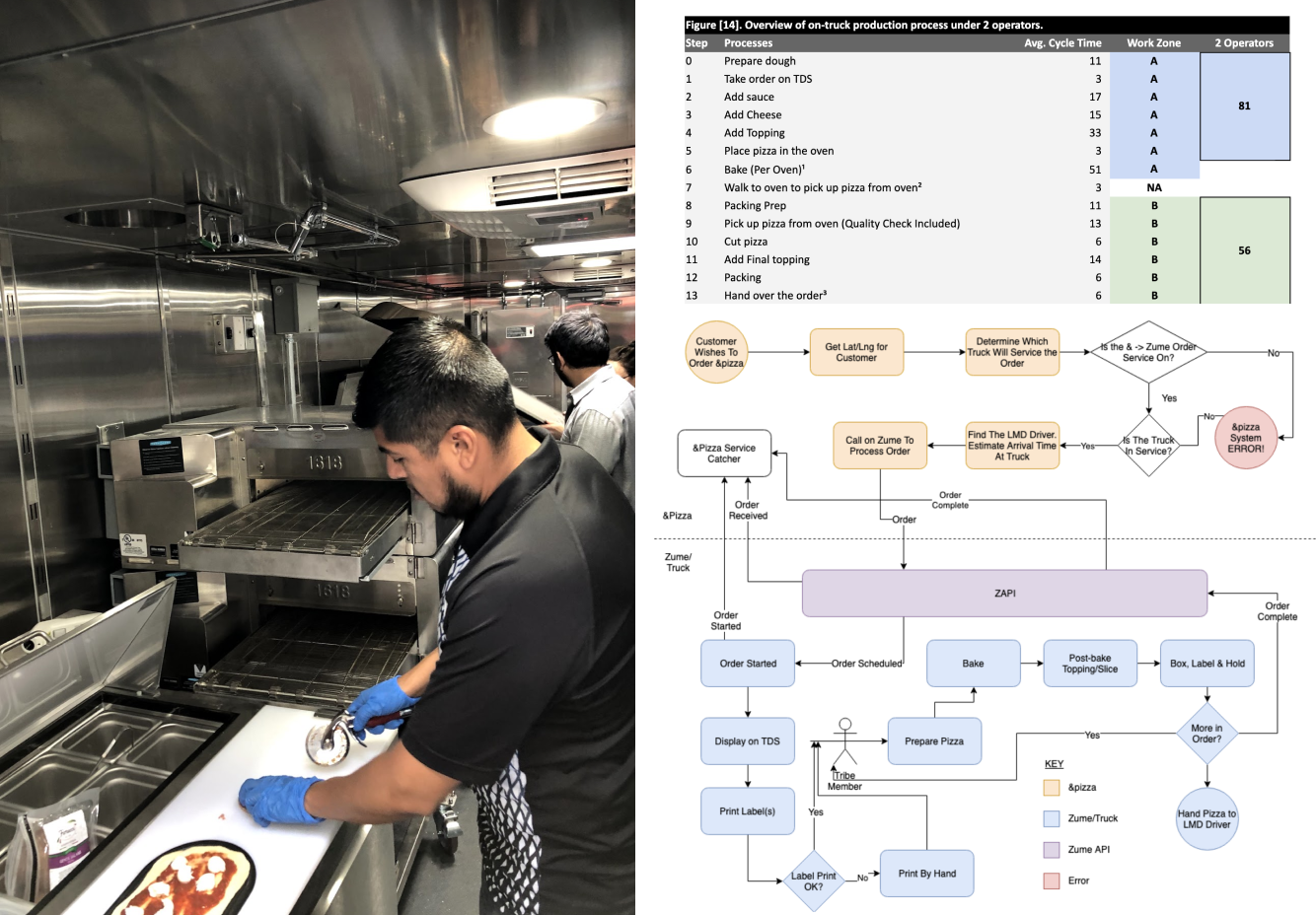
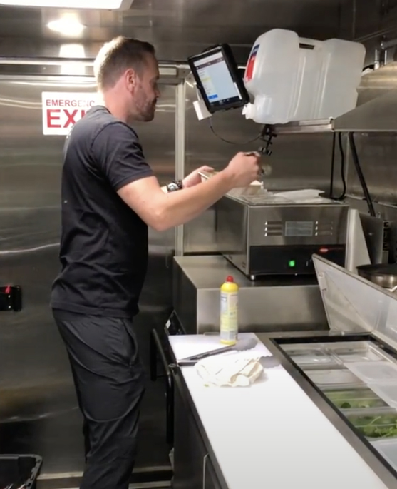
Observing our hardware team prototyping an &pizza truck, as well as some of their documentation
Key differences from Zume Pizza
Really, the only thing in common was pizza!
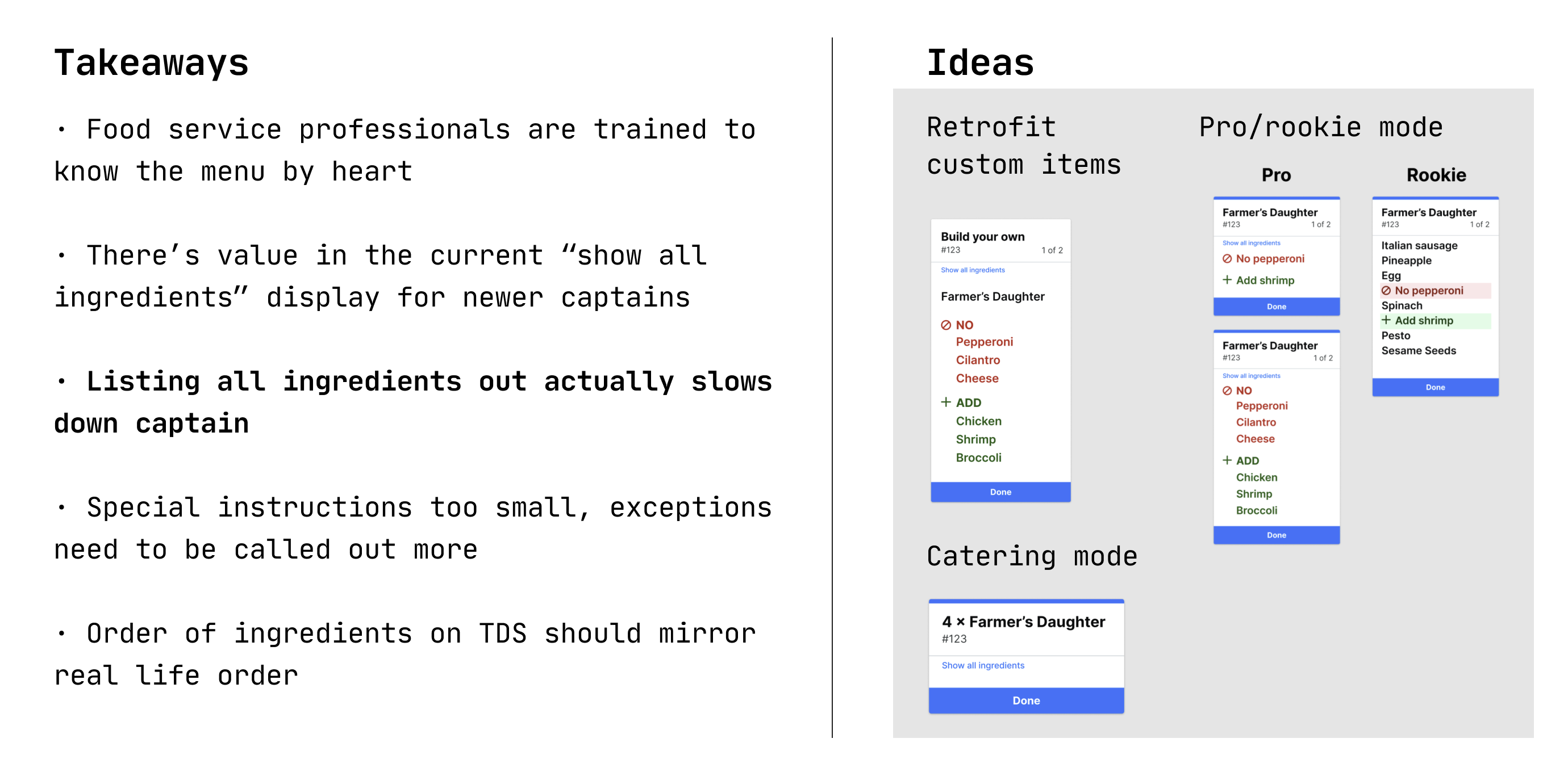
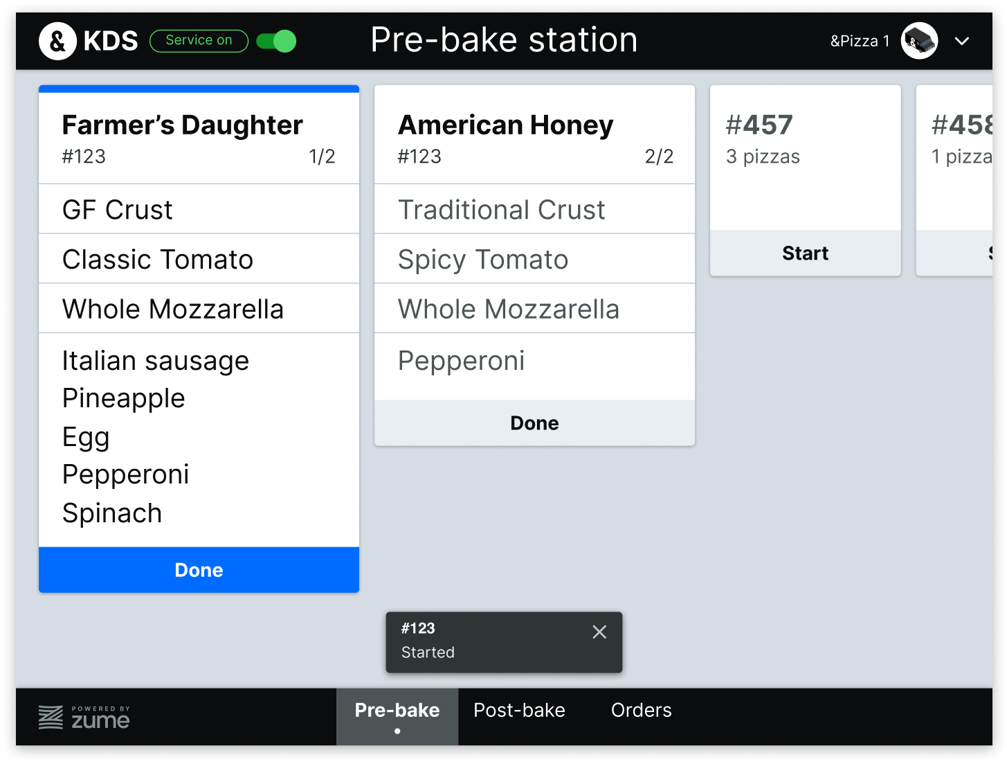
&pizza didn’t use smart ovens, so the captain was more in control. They prepared all their pizzas made-to-order on the truck. 70% of their orders were custom, so we had to list out all the ingredients, instead of designing for a pizza as a single SKU.
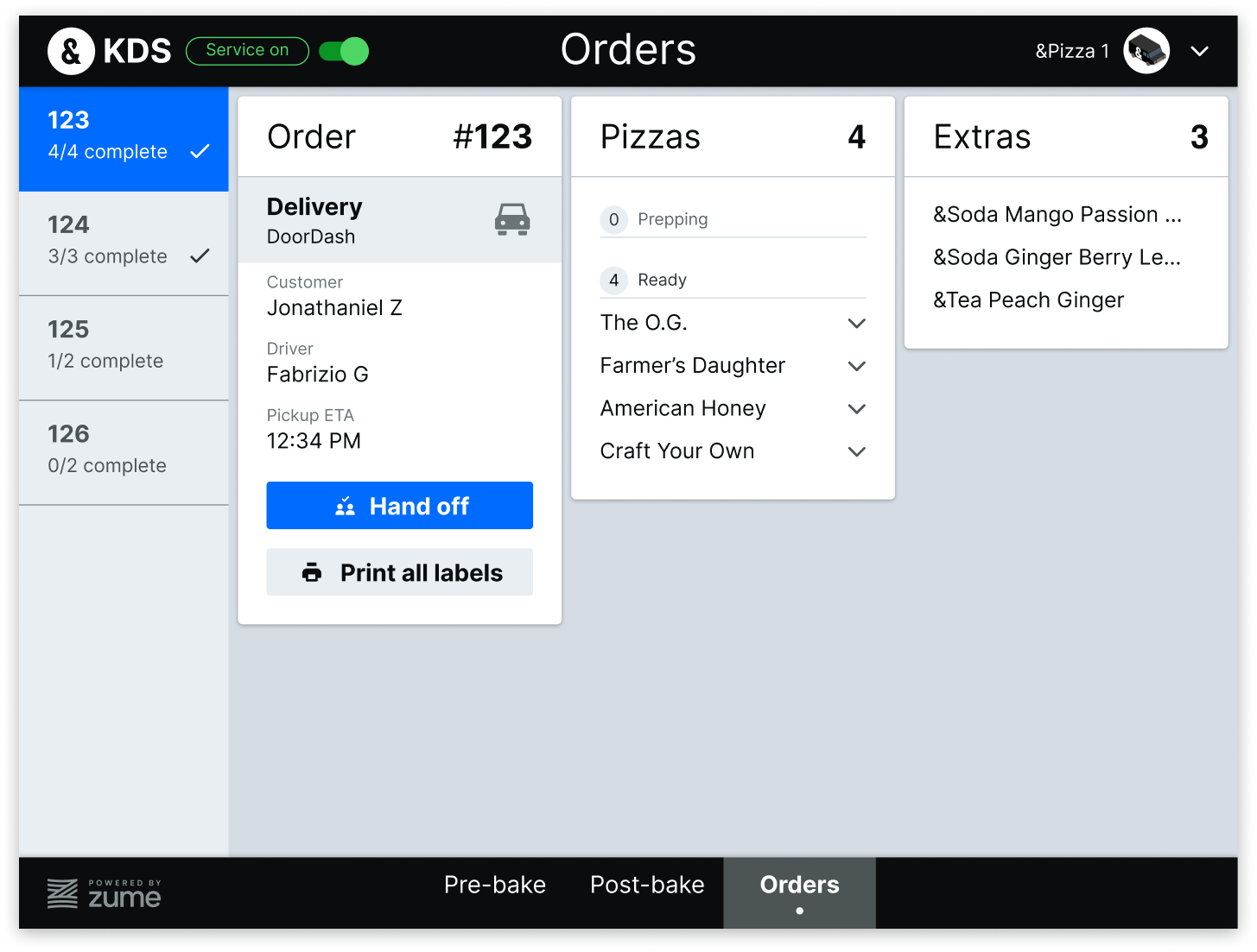
They wanted to capture certain timestamps we hadn't at Zume Pizza, such as when an order (not just an item) had been started, so we needed a way to capture that info.
Instead of the action-based mental model of TDS, KDS became item- and ingredient-based.
Yes, the ingredients are goofy—there was no limit on the number of ingredients (or flavor combinations)!
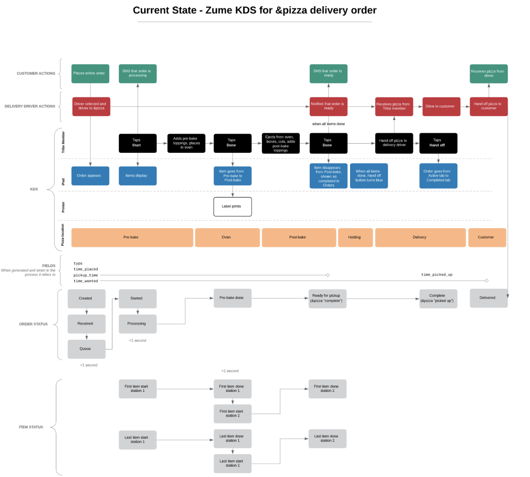
I made a chart mapping out actions of different personas, where the software needed to step in, and when orders and timestamps were updated
Prototyping
After understanding their system, we set up a cardboard prototype, similar to our earlier research. We used our in-house Captains to test Figma prototypes with different frameworks, like showing both stations on one screen for transparency, or having a dedicated view for each station.
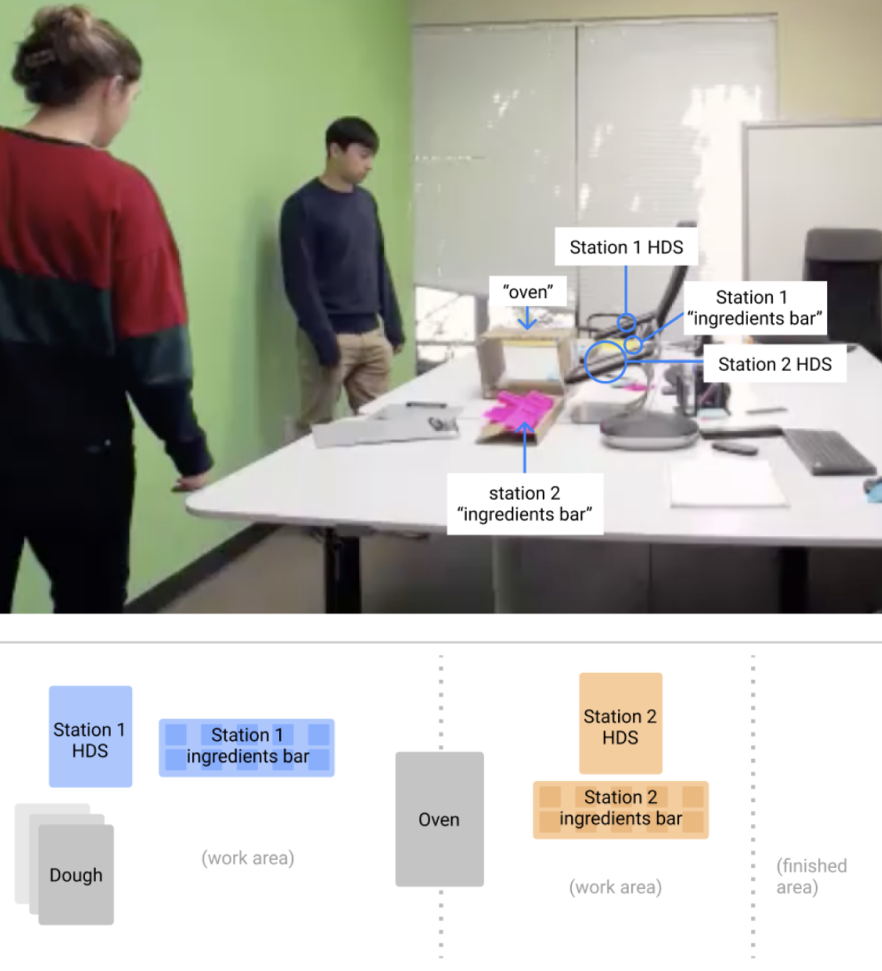
Key learnings from user testing
- Separate views for each station was much easier
- The idea of “starting” an order was clear
- Users could understand this system with minimal instruction
- Text was large enough for truck constraints
Delivery
Ultimately we cranked out this design, using the styles I had established for our Zume Design System, which has held up for them for almost a year now, with just some very small improvements.
Results
- &pizza ordered 40 trucks from Zume
- After piloting KDS in 2 brick and mortars, planning full rollout (as of April 2020)
- Weekly calls with &pizza to keep a close feedback loop
- We've identified minor changes, like terminology, printer triggers, order completion times
More details on turning KDS into a SaaS product coming soon... Here's some research artifacts:
